Monday, December 14, 2009
Wednesday, December 9, 2009
Evil eye
My last project was on the History of the Evil Eye. It's the first thing this semester that I've actually liked that I did. I really wanted it to look sketched out, so I drew a design of an eye with a pen, and then added what it the realthing looks like behind that. All around it is the text explaining what it is. Even though I'm not good with computers and photo shop and all that jazz, I really did enjoy this project, and I liked how it turned out.
Monday, December 7, 2009
Sunday, November 1, 2009
Catalog
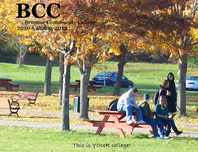
This projetc was so hard for me. The first idea that I had (someone walking away from the camera with fists of victory in the air) fell apart, as did the two other ones I had as back up ideas (a comic book, and a movie theater one). I ended up with a random snap shot of a few students hanging out outside. I chose this one because it was really natural, and the scenery around them was really pretty; I was able to capture some of the folliage. I wish that I could have done more with it, but I just don't understand the programs we have to use, so hopefully I start understanding them more.
Wednesday, October 28, 2009
Wednesday, October 21, 2009
Sunday, October 4, 2009
Saturday, September 26, 2009
essay
For my illustrator project, I chose the letters X, J, C, O, L, G, and Q, only because I like the mix of hard and soft lines and edges that they all have. I did two different fonts, however (funny story) I picked one that wasn't on the sheet, and I can't read what it says on the computer, but it's some kind of squiggly, very curly cursive that I liked. I aplied that font to the letters that have a lot of curves and curls because it looks mysterious to me. The second font I chose was called Didot. I liked that one because it was the complete opposite of the first one, in that it was very stern and conservitive, and the other one was free.
I began by taking my curly letters and I sprawled them across the page, making a winding path for the eye. That path ends with the tip of the Q, which points the eye directly down to the row of X's. I wanted to make an almost illusion with the X's, so every-other one was flipped upside down, see if you can catch it. After that, I made the counter-forms of two J's, but when you look at them (or at least when I look at them) you see three, because I overlapped the two forms.
This project was immensly difficult for me; I've never used any of these kinds of programs, and technology completely rejects me. Because I struggled so much, I didn't enjoy doing it as much as I wanted to, so hopefully I will begin to understand these programs more and I will be able to enjoy what I'm doing.
Wednesday, September 2, 2009
Monday, August 31, 2009
Subscribe to:
Posts (Atom)


